Tuesday, April 28, 2009

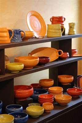
Done shooting pics for a few weeks

This new Cranberry glaze is just amazing! I want to do some more testing with it, then we may make up a HUGE batch of it so we can add it to our mainstays for a few years. Anyone disagree?


Our current range of standard colors:
Sunset, Tangerine, Lime, New Turquoise/Seafoam color,

Blue, New Forest/Moss/Lichen color.

HURRY UP with those names folks! WE NEED NEW NAMES for these two new glazes!


It was that time again... time to shoot new images for Etsy, for our blog and for the website. Our website needs some major revisions... might even qualify for a real overhaul from Web1.0 to Web 2.0... just have to find the time to make that happen.

In the midst of all this fun, we started our Name That NEW Glaze Contest. So far we have had more than 30 entries! Keep em coming!!

We'll keep this contest open for another week and a half and then we'll name the winner/s.
Click HERE to enter this contest. Winner gets a pot of their choice in one of the new colors!

Saturday, April 25, 2009

New Pots on Etsy today


Finally had a few minutes this week to get new images shot of some of our recent work. Lots of pitchers in these last few firings, so it was time to get some new images made. Also tried some experiments with our cranberry glaze. Took it a bit hotter and it is a MUCH better glaze now. Really like it. Unfortunately, since we dont normally have time or need to fire much hotter, and it makes all of our other glazes look weird, we need to reformulate the Cranberry. Should be ready in a few weeks I hope!

The Butter Yellow is a glaze we semi-retired last year. It just wasn't moving off the shelves nearly as fast as all of our other glazes. Sure enough, we tell folks we aren't gonna make it anymore and suddenly there's a furor! Go figure. So we brought it back for this year. When this batch is out, we're done with it.

Thursday, April 23, 2009

Let the Naming Contest Begin

These are the two new colors. You get to name them!


These are the two new colors.


Color on the left is the NEW color. Mug on the right is glazed in our old Turquoise. And the new name for the new glaze on the left is??? (Make sure you identify this new glaze name as Glaze #1)


The teabowl on the left is glazed in our Forest Green. The glaze on the right is our new glaze #2, which needs a name. Ideas? (Make sure you identify this new glaze name as Glaze #2)

THE CONTEST BEGINS:

We occasionally hear that our glaze names are too staid, normal, perhaps
even boring. So, knowing that we have to use these glaze names with a straight
face, to sell our work to galleries, to post on our website,.... with that in mind,
we open our contest to you.

We need new names for our two newest glazes!

Here's the deal.... if we LOVE your choice of name, and we use it,... then YOU get
a pot of your choosing in that color. We will keep the contest open for two weeks to give everyone a chance to apply. A final decision will be made on May 7th. Winners will
be announced that day.

How to enter:

You have two ways of entering.
You can email us by clicking HERE

or you can submit your choice of name by leaving
us a comment on the blog.
Please indicate glaze #1, glaze #2.

Best of luck to everyone!

Purple Platters in the Rain


The forecast calls for more rain. Then sweeping sun and SUN and heat. Should make for a wonderful end to a very wet and windy week.

A few year ago, I made this platter for a friend. She has a thing about purple glazes. She was of the mind that purple and glazes simply weren't possible. Sure, folks have made plenty of copper red glazes and then contaminated them with chun blues. It isnt purple. It is red and blue... looks purple till you get close. She wanted a true knock-your-socks-off purple. Rich royal purple. So I played around with some ideas and came up with this one. I love the balance of the dark stormy purple against the grey lilac beside it.

Now I am working with a woman in Rochester who is also working on developing a true rich purple. This time we're working at cone 6 and trying to achieve a rich purple with Mason Stains. Sounds easy enough, but only if you've never tried it. Mason stains are wonderful in theory, but they are not nearly as simple to work with as most potters assume. About half the time, the colors come out washed out, bleached, faded, or just off. The other half of the time, they are "close" to what was advertized. For my money, they had better darned well provide the color I paid so bloody much for!

My first tussle with Mason Stains was over Pansy Purple. We spent the better part of three years trying to achieve a truly saturated dark purple... in a satin glaze. Let me tell you... there is not a whole lot harder to get. Talk about contradictions. All the things that make the glaze melt when we want, and have the surface we want... all conspire against this dark rich purple working.

In the end, it was compromise. I gave up my desire for satin and settled for almost glossy. It relinquished and relented and now we get dark purple MOST of the time. Sometimes it has more of a cranberry-ish quality. Other times it comes close to being blackberry.

Wednesday, April 22, 2009

Just a taste


WARNING: THIS IS NOT THE CONTEST.

But it may help get you thinking in the right frame of mind.

Here's a quick glimpse at two of our new colors.
The first two planters demonstrate our newest additions to our palette.

Breaking Through the Crust

101298A ©2008 "The Upper Crust vs. Down Below"


This is one of those platters where the upper surface is all craggy and muted and rough. Turns out, underneath all of that nastiness is rich color, fluid moving glazes... and yet you can only find that where the upper crust has broken through to revel this.

The first time this "breakthrough" happened, I was dismayed. A fellow grad student at Utah State thought it would be a good idea to pop some of the glaze bubbles on a platter... unbeknownst to me. Seeing the results after the fact, I wasn't thrilled. But as I lived with it, and came to see what was under those blistered glazes, I realized the tantalizing colors and fluid passages under the glaze.


About this same time (ca. 1998), I had an opportunity to visit the Craters of the Moon National Monument in Idaho. The feeling of being inside a lava tube is amazing. Nothing comes close. But to a potter, it is like being the glaze. You can shine your flashlight along the floor, walls, ceiling, and find beautiful fired rock that recalls tenmokku glazes, oil spot glazes, iridescent colors everywhere... but without light, it all seems one dark blob. Up on the surface of the lava tube, life is harsh, barren, cracked and scorched.

Fast forward a little more than a decade, and I can see my life's journey slowly unfolding in these new glazes on the platters. I had NO intention of ever re-creating a lava tube on a platter. Far be it from me to try to copy nature. It's been done enough, and done badly enough to scare me away from such pretense.

Looking deeper into these fissured and bubbling scorched platters though has encouraged me to look a little longer and deeper. Sometimes you find that geode, other times it's still just a rock.

Tuesday, April 21, 2009

Different ways of seeing

I was having a quick chat over on Michael Klein's blog earlier today. He's been shooting his pots in black and white, in camera. Lots of fun in that direction for sure! Sometimes I think clay lends itself to B&W. When I worked for Mike Cohen he used to shoot B&W at least 1x a year when he was getting his poster ready for his Holiday Studio Sale. It was almost as though he saw B&W during the time he prepared for his shoot. Somethings just dont photograph well as B&W...and others look timeless. This stimulated me to play with how I see color vs B&W.


This is the original image. Straight from the camera. Still not what I was hoping for.


This the first incarnation, in Nik SilverEfex Pro. Not too terribly interesting. But it has shades of what is to become.


So I worked on it for a while in Nik SilverEfex Pro, adjusting contrast, texture, depth .... and then toned the image a little.


Not quite there, but by ramping up the saturation on the lower layer (original image) then adding the black and white image over it, with about 50% opacity, I can see through the darker layer to the colorful image below it. It desaturated some of the color, but also cranked the contrast a different direction and added some grey-depth. Not sure that term exists, but I am sure you get what I mean.


Sometimes I see only color, other times only form.
Somedays I see in black and white.
Other times I need to see a mix of saturated color and sharper tones.

Spring Rains

By early morning the winds had kicked up. With little rain at first, it was simply cold, sharp and bitter. Noontime came and with it sheets of rain and gusts that bent the tops of our white pine trees. Every now and again, we would hear the slap of a broken branch falling against the roof or the windows.

My hope was that the rain would pass and I would have light like we had yesterday. What I really wanted to do today was to take the kayaks out on the lake and paddle around a bit. Suffice to say, it definitely didn't happen. I can only imagine how wind-whipped those waves must have been out on the lake.


Monday, April 20, 2009

Monday and still no new pictures of our new glazes

Sorry. I ended up spending most of yesterday glazing and loading kilns.


When I finally had a spare moment, it got quickly filled by needing to re-wash plate setters. I had been meaning to do this back in September. Figuring no less than 2 firings per week since November means that these setters have been in desperate need of new kiln wash. I really prefer applying kiln wash on warm sunny days... outside. So, Sunday fit that bill.


I can't think of anything that screams SPRING as loudly as forsythia. One minute they are bare twigs and the next warm sunny day they POP like yellow fireworks.

Saturday, April 18, 2009

Sunday in the Studio


Table after table of pots being glazed and readied for the toaster.


Had a great firing this week. Wonderful pots and some nice surprises.


Sundays are starting to mean glazing, cleaning pots, loading the toaster, and cleaning up the glazing mess. Hopefully it also means more kayaking! After half a year of weekends of hockey, Spring is here and that means time in the studio all day, all weekend. Here are the fruits of our labours from this weekend so far.

Upcoming Mothers Day Show in Trumansburg

Friday, April 17, 2009

How do you capture those special moments in clay?

Hopefully you know (remember) what I mean. How do you show someone how completely off-center their clay is? How do you demonstrate that perfect moment when everything lines up and all is well with your throwing? How do you show that even the worst day at the wheel is better than the best day in the office?

Perhaps these images lend a hand.


Dana and I working on what would become one of her best bowls to date. My only wish for our studio is to have a wheel whose height was easily adjustable. Dana needs a wheelhead about 4 inches higher to allower her a more comfortable throwing height.

That feeling of finally NAILING the centering process!! The joy of seeing the clay stop bobbing and weaving!!


What was I just saying about bobbing and weaving? Oh, yeah. Sometimes it's a bugger getting things to go into center.

And then it happens. A light goes on and all is aglow with that awesome feel-good moment of knowing the clay is right where it needs to be.


Justin makes his um-teenth bowl of the afternoon. Once he got the hang of things ZOOOOM ! Out came the bowls and whoosh went the mud!

Thursday, April 16, 2009

To Take Your Breath Away

Aurora shot this on her little Kodak easyshare camera yesterday morning. Talk about breath-taking!

Wednesday, April 15, 2009

Loving my wife means

loving her love of shoes.


Of all the pictures I have taken of Nancy, this is my all-time favorite. She looks like she is just gonna POP! And why? Because she is looking at the latest ad from Keen. She loves her many pairs of Keens.

Our apprentice Hannah asked a few weeks back if someone in our family worked for Crocs, New Balance or Keen. She was walking through our kitchen and saw the mountain of shoes that inhabit our kitchen floor, and those brands made up the bulk of our shoe pile. We have a lot of shoes in this household... and they are mostly Crocs, New Balance or Keen. That's not a bad thing, right?


Pots like I promised

When I say we have STACKS of bisqueware.... I mean, STACKS and STACKS and STACKS.
We could glaze eight kiln loads worth of pots... if we only had the time to get it all glazed.
So why so many pots? Well, having an apprentice has allowed me to focus a lot more of my time on throwing pots since she is taking care of making all of our slab built plates and serving trays.
It is also my intention to have enough work to get us through Summer without panic and frustration like we've seen each summer for three years running!


This is the old Turquoise, along with the Lime and Blue and Forest glazes.


We have a new replacement color for our Turquoise. We'd been making turquoise for about 5 years now and it was time to let it go. It never really made me say WOW. It was a decent color, but as a glaze it was lacking. Sort of a flat even color, no depth, always too glossy, and inevitably obscured my texture. So, a week ago, I took the remaining 2 gallons of Turq and mixed it with the remaining 3 gallons of an ancient glaze called Seafoam (from about 7 years ago!) and sent it through the firing. It came out a wonderful color, but still too close to Turquoise. And worse it was even shiny-er!

On Monday I had a chance to play a little bit with the glaze and sat there thinking about what I would change and how to get it to stand up and dance for me. I ended up adding 5% EPK (kaolin) and an extra 1% copper oxide. Fired it up Monday night. Unloaded today and WOW. Now it sings.

All that is left is to name it. We are going to host a competition to name this new turquoise-ish color. (we're gonna do this for some of our other new colors too... just wait!!)

So here are the rules: no name suggestions till we begin the competition. All submissions have to be via the blog.

The prize: Winner gets a pot of their choosing in this new color.

Contest will begin as soon as I post a GREAT new image of this color sometime next week. Just wait!!!

Daily Flower Update


Yeah, I know. By now you've either figured out that I love my flowers or you've abandoned this blog in hopes of finding some other blog that yaks about clay more often. Fine.

For those of you who have remained....here are today's wicked pix of what's in bloom.

Tuesday, April 14, 2009

More images from Letchworth State Park


Just a few quick images from our day at Letchworth. I definitely need to find a way to be there for a longer period of time. I would love to be there for both sunrise and sunset. Great area for photographs!